


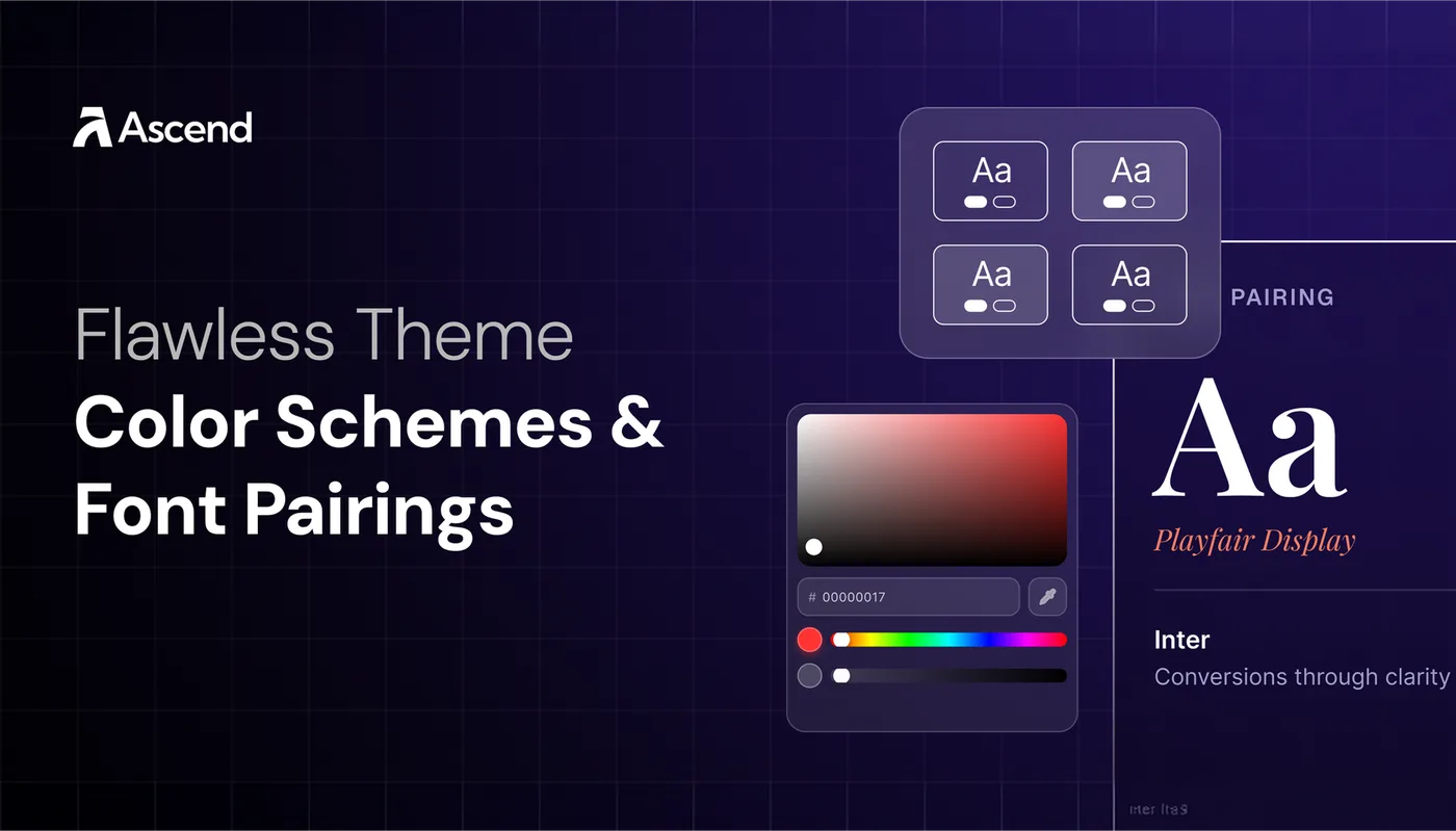
Flawless Theme Color Schemes & Font Pairings
Sep 9, 2026 · 10 min read · By Ascend Themes
Color and typography shape how quickly shoppers understand a store. Flawless gives you reusable color schemes and separate controls for headings, body text, and buttons. The five combinations below are practical starting points with readable text and button contrast.
Your starting point
Start with a pairing and palette that suit your products, then apply them as a small, consistent system.
🎨 1. Set up your color schemes
Open Theme settings → Colors in the Flawless theme editor. You can choose from the available schemes or add another scheme for your brand.
A color scheme is a coordinated set of roles rather than one background color. Depending on your version of Flawless, the fields may include the background, text, buttons, button labels, outlines, shadows, offers, and other section elements.
Give each scheme a purpose:
| Option | Use and details |
|---|---|
| Base scheme | your easiest combination to read. Use it for product grids, descriptions, FAQs, and information-heavy sections. |
| Contrast scheme | a strong light-on-dark or dark-on-light combination for a hero, important message, or major page transition. |
| Accent scheme | a restrained brand color for a featured collection, campaign, or short section that deserves attention. |
Most stores only need a few active schemes. Repeating them creates visual rhythm and makes new sections easier to style later.
🧩 Treat every scheme as a complete set
Choose the background and text first, then test every action and state that appears on top of them. A color can look strong by itself and still fail once it is used for a button label, outline, badge, or sale message.
Preview each scheme with real content:
- a short and long heading
- body text
- a solid button
- an outline button or text link
- product cards with regular, sale, and sold-out states
- icons or form borders
Check both normal and hover states. If a button disappears when someone hovers over it, the scheme is incomplete even if the default state looks good.
🖼️ 2. Apply schemes across the store
Many Flawless sections include a Color Scheme setting. This lets you reuse the same coordinated colors across Media and Text, Featured Collection, Multi-column, product sections, and other areas without adjusting each element individually.
Change the scheme when the entire section needs a different level of emphasis. For example, a calm base scheme can carry most of the page, followed by a contrast scheme for a testimonial or campaign, then back to the base scheme for the next product grid.
Avoid alternating colors after every section. Too many changes divide the page into unrelated pieces and make it harder to see which content matters most.
From Flawless 12.0, supported Featured Collection and Collection Product Grid sections can use a separate product-card color scheme. This is useful when the section background changes but the cards need their own readable surface. Use the override only when it solves a contrast or clarity problem.
🏠 Check special color settings in the Header and drawer
The Flawless Header can use separate schemes for the Header and its menu. This gives the open dropdown or drawer a clear surface even when the main Header sits over a different background.
If you use a transparent Header, set a content color and alternate logo that remain visible over the hero image. Check every slide or image used behind it. A logo that reads clearly over one photograph may disappear over the next.
Flawless also lets you choose a separate scheme for the navigation drawer. Test that scheme on a phone with nested links opened, so headings, dividers, icons, and promotional cards remain easy to distinguish.
🔤 3. Set heading, body, and button typography
In Theme settings → Typography, Flawless provides individual controls for heading levels H1 through H5. You can choose the heading font, set an exact size in pixels for each level, and adjust line height and letter spacing.
Give each level a predictable role:
| Option | Use and details |
|---|---|
| H1 | the main page or article title |
| H2 | major page sections |
| H3 | groups within a section |
| H4 and H5 | smaller supporting groups or labels |
Each level should look clearly smaller than the one above it. If H1, H2, and H3 feel almost identical, shoppers cannot tell where one topic ends and the next begins.
A useful starting point is approximately 40 px for H1, 32 px for H2, 26 px for H3, 22 px for H4, and 18 px for H5. Treat these as suggestions. The same number can look larger or smaller depending on the font, weight, and letter shapes.
📖 Keep body text comfortable to read
Flawless gives body text its own font, percentage-based size scale, line height, and letter spacing. These settings affect product descriptions, articles, supporting copy, and other text across the store.
Choose a body font that stays clear in longer paragraphs and smaller interface text. Decorative fonts may work for a short heading, but product descriptions, variant names, policies, and navigation labels need simpler letterforms.
Use line height to add enough space between lines. If paragraphs feel dense on a phone, increase the body scale or line height before adding more visual decoration. Letter spacing should remain subtle because wide gaps make sentences slower to read.
🔘 Style button text as part of the system
Button typography has separate controls for font, pixel size, line height, and letter spacing. Use these settings to keep calls to action consistent across product pages, banners, and featured sections.
The button font can match the body font or use a clear companion. It should remain readable at a glance, especially for short labels such as “Add to cart,” “Shop now,” or “View collection.”
Avoid forcing long labels into small buttons. If the label wraps or feels cramped, shorten the copy or give the button more space. Check the label against the button background in its normal, hover, disabled, and sold-out states.
🛍️ 4. Choose a color scheme and font pairing
These combinations are starting points, not fixed rules. Each recipe follows the same groups shown in the Flawless color scheme editor: Typography, Background, Button, Controls, Hover effect, Other, and Additional. Check whether the suggested fonts are available in your Shopify font picker.
If one is unavailable, choose a font with a similar character and keep the same heading-to-body relationship.
🌿 Wellness products
Font pairing: Fraunces for headings + Manrope for body text and buttons
Fraunces adds a warm, natural character to short headings, while Manrope keeps ingredients, instructions, and product details clear.
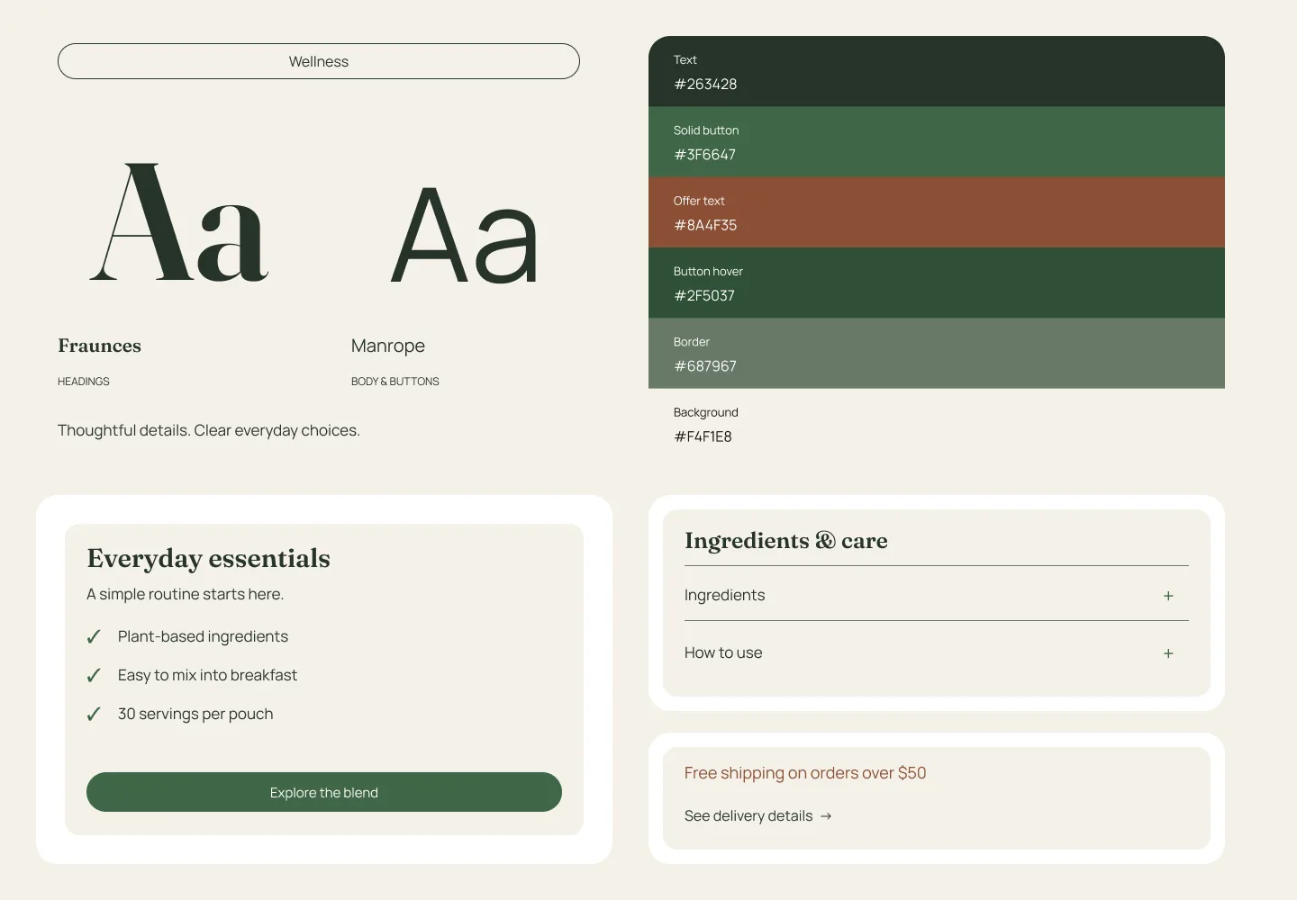
Palette: #F4F1E8 · #263428 · #3F6647 · #8A4F35
Flawless color scheme settings
| Flawless setting | Value |
|---|---|
| Typography · Text | #263428 |
| Background · Background | #F4F1E8 |
| Background · Gradient | No color chosen |
| Button · Solid button background | #3F6647 |
| Button · Solid button label | #FFFFFF |
| Button · Outline button | #263428 |
| Button · Icons | #3F6647 |
| Button · Links | #263428 |
| Controls · Navigation arrow | #FFFFFF |
| Controls · Navigation arrow border | #3F6647 |
| Controls · Navigation arrow background | #3F6647 |
| Controls · Slider | #3F6647 |
| Hover · Button label | #FFFFFF |
| Hover · Button background | #2F5037 |
| Hover · Navigation arrow | #FFFFFF |
| Hover · Navigation arrow border | #2F5037 |
| Hover · Navigation arrow background | #2F5037 |
| Other · Input | #263428 |
| Other · Variant | #263428 |
| Other · Border | #687967 |
| Other · Offer text | #8A4F35 |
| Additional · Primary | #3F6647 |
🌸 Beauty products
Font pairing: Cormorant Garamond for headings + Inter for body text and buttons
The heading font creates an editorial feel without affecting the clarity of descriptions, shade names, and purchase controls.
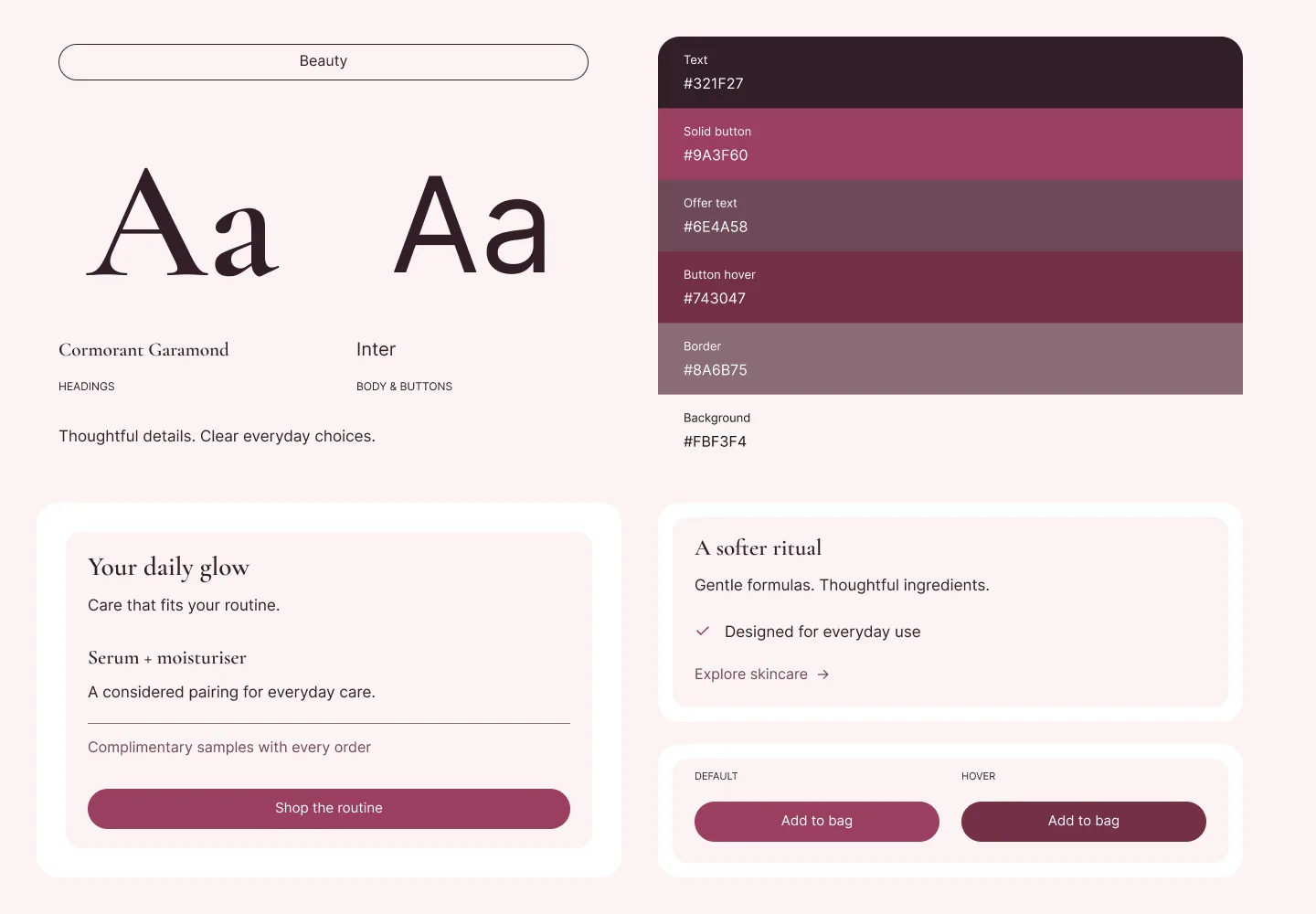
Palette: #FBF3F4 · #321F27 · #9A3F60 · #6E4A58
Flawless color scheme settings
| Flawless setting | Value |
|---|---|
| Typography · Text | #321F27 |
| Background · Background | #FBF3F4 |
| Background · Gradient | No color chosen |
| Button · Solid button background | #9A3F60 |
| Button · Solid button label | #FFFFFF |
| Button · Outline button | #321F27 |
| Button · Icons | #9A3F60 |
| Button · Links | #6E4A58 |
| Controls · Navigation arrow | #FFFFFF |
| Controls · Navigation arrow border | #9A3F60 |
| Controls · Navigation arrow background | #9A3F60 |
| Controls · Slider | #9A3F60 |
| Hover · Button label | #FFFFFF |
| Hover · Button background | #743047 |
| Hover · Navigation arrow | #FFFFFF |
| Hover · Navigation arrow border | #743047 |
| Hover · Navigation arrow background | #743047 |
| Other · Input | #321F27 |
| Other · Variant | #321F27 |
| Other · Border | #8A6B75 |
| Other · Offer text | #6E4A58 |
| Additional · Primary | #9A3F60 |
👕 Fashion
Font pairing: Space Grotesk for headings + Inter for body text and buttons
This pairing feels modern and direct. It works especially well when campaign photography changes often and the interface needs to remain neutral.
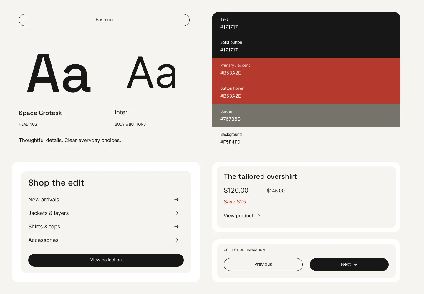
Palette: #F5F4F0 · #171717 · #B53A2E
Flawless color scheme settings
| Flawless setting | Value |
|---|---|
| Typography · Text | #171717 |
| Background · Background | #F5F4F0 |
| Background · Gradient | No color chosen |
| Button · Solid button background | #171717 |
| Button · Solid button label | #FFFFFF |
| Button · Outline button | #171717 |
| Button · Icons | #171717 |
| Button · Links | #171717 |
| Controls · Navigation arrow | #FFFFFF |
| Controls · Navigation arrow border | #171717 |
| Controls · Navigation arrow background | #171717 |
| Controls · Slider | #171717 |
| Hover · Button label | #FFFFFF |
| Hover · Button background | #B53A2E |
| Hover · Navigation arrow | #FFFFFF |
| Hover · Navigation arrow border | #B53A2E |
| Hover · Navigation arrow background | #B53A2E |
| Other · Input | #171717 |
| Other · Variant | #171717 |
| Other · Border | #76736C |
| Other · Offer text | #B53A2E |
| Additional · Primary | #B53A2E |
☕ Food and drinks
Font pairing: DM Serif Display for headings + Source Sans 3 for body text and buttons
The serif heading gives product stories warmth, while the body font keeps ingredients, preparation details, and nutrition information easy to scan.
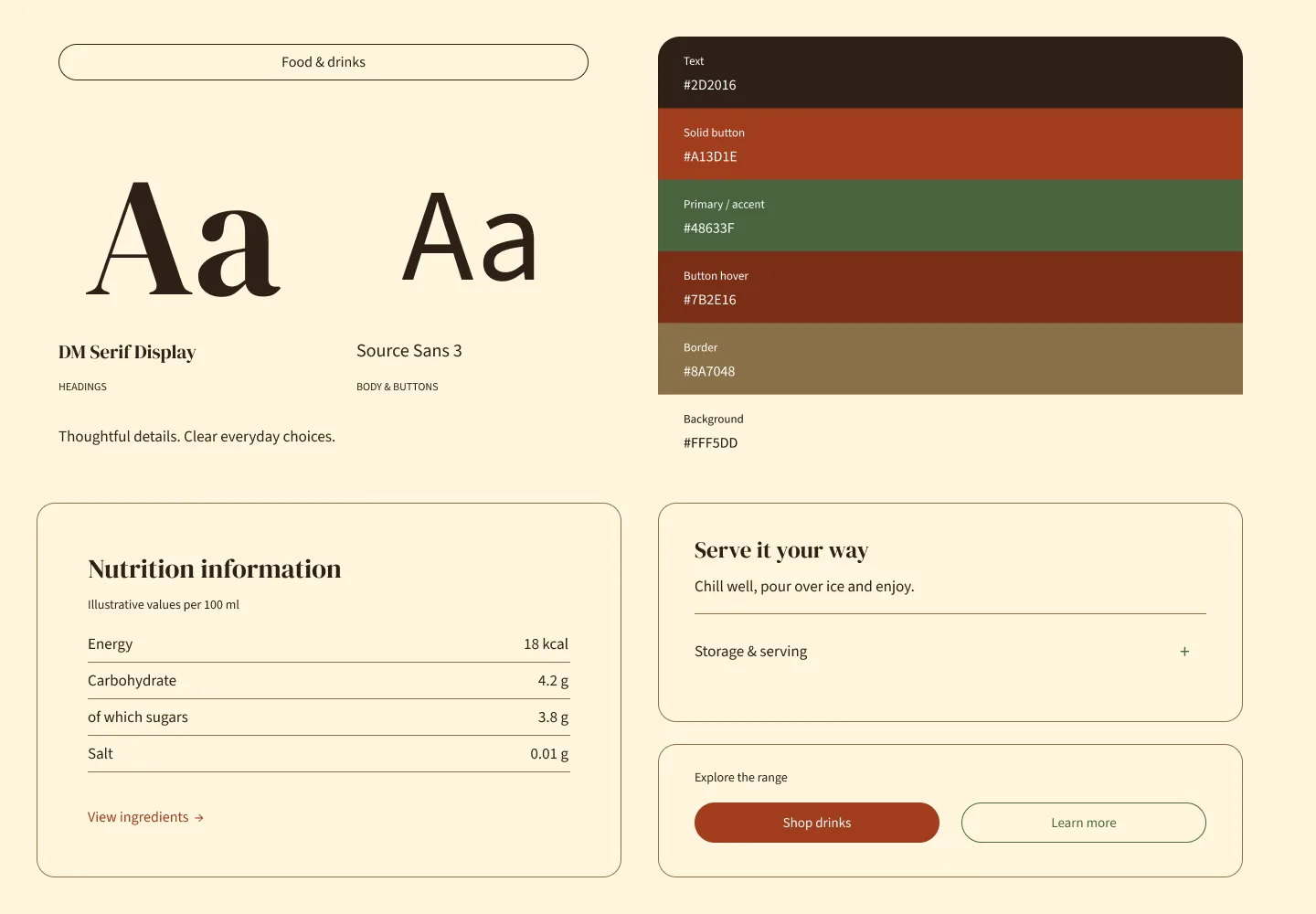
Palette: #FFF5DD · #2D2016 · #A13D1E · #48633F
Flawless color scheme settings
| Flawless setting | Value |
|---|---|
| Typography · Text | #2D2016 |
| Background · Background | #FFF5DD |
| Background · Gradient | No color chosen |
| Button · Solid button background | #A13D1E |
| Button · Solid button label | #FFFFFF |
| Button · Outline button | #48633F |
| Button · Icons | #48633F |
| Button · Links | #A13D1E |
| Controls · Navigation arrow | #FFFFFF |
| Controls · Navigation arrow border | #A13D1E |
| Controls · Navigation arrow background | #A13D1E |
| Controls · Slider | #48633F |
| Hover · Button label | #FFFFFF |
| Hover · Button background | #7B2E16 |
| Hover · Navigation arrow | #FFFFFF |
| Hover · Navigation arrow border | #7B2E16 |
| Hover · Navigation arrow background | #7B2E16 |
| Other · Input | #2D2016 |
| Other · Variant | #2D2016 |
| Other · Border | #8A7048 |
| Other · Offer text | #A13D1E |
| Additional · Primary | #48633F |
✨ Accessories and jewellery
Font pairing: Playfair Display for headings + Manrope for body text and buttons
Playfair Display brings contrast to collection and campaign headings. Manrope keeps materials, dimensions, pricing, and variant choices practical.
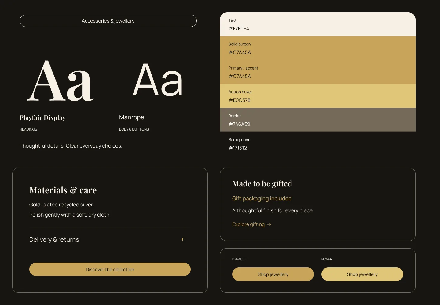
Palette: #171512 · #F7F0E4 · #C7A45A
Flawless color scheme settings
| Flawless setting | Value |
|---|---|
| Typography · Text | #F7F0E4 |
| Background · Background | #171512 |
| Background · Gradient | No color chosen |
| Button · Solid button background | #C7A45A |
| Button · Solid button label | #171512 |
| Button · Outline button | #F7F0E4 |
| Button · Icons | #C7A45A |
| Button · Links | #C7A45A |
| Controls · Navigation arrow | #171512 |
| Controls · Navigation arrow border | #C7A45A |
| Controls · Navigation arrow background | #C7A45A |
| Controls · Slider | #C7A45A |
| Hover · Button label | #171512 |
| Hover · Button background | #E0C578 |
| Hover · Navigation arrow | #171512 |
| Hover · Navigation arrow border | #E0C578 |
| Hover · Navigation arrow background | #E0C578 |
| Other · Input | #F7F0E4 |
| Other · Variant | #F7F0E4 |
| Other · Border | #746A59 |
| Other · Offer text | #C7A45A |
| Additional · Primary | #C7A45A |
Start with the direction closest to your product photography and packaging. Add the values to one Flawless scheme, then preview it on a section containing text, buttons, arrows, variants, borders, and an offer. Gradient is left empty in these recipes so the Background colour stays predictable.
✅ Check before you finish
Test your system on the homepage, a collection, and a product page. Include desktop and mobile views, then check:
- headings form a clear size hierarchy
- body text can be read without zooming
- buttons remain readable in every state
- outline buttons and links are visible against their backgrounds
- sale, sold-out, and offer text does not rely on colour alone
- product cards stay clear inside every section scheme
- transparent Header text remains readable over every image
- the mobile drawer has enough contrast for links, icons, and dividers
As a general accessibility target, use at least 4.5:1 contrast for normal text and 3:1 for larger text, icons, and input borders. Check the actual combinations used on the page, including text over images and gradients.
✨ Wrapping it up: build the system before the page
Choose a small set of color schemes, give each one a job, and test every text and button state inside it. Then set H1 through H5 as a descending hierarchy, keep body text comfortable, and make button labels consistent. Once those foundations work, apply them across sections with restraint.
Repeating visual rules across pages helps shoppers scan the store and makes the brand feel considered.
Get the next teardown in your inbox.
One email a month: new writing, release notes and the occasional look inside how Flawless is built.