


Create Navigation Customers Understand
Sep 8, 2026 · 8 min read · By Ascend Themes
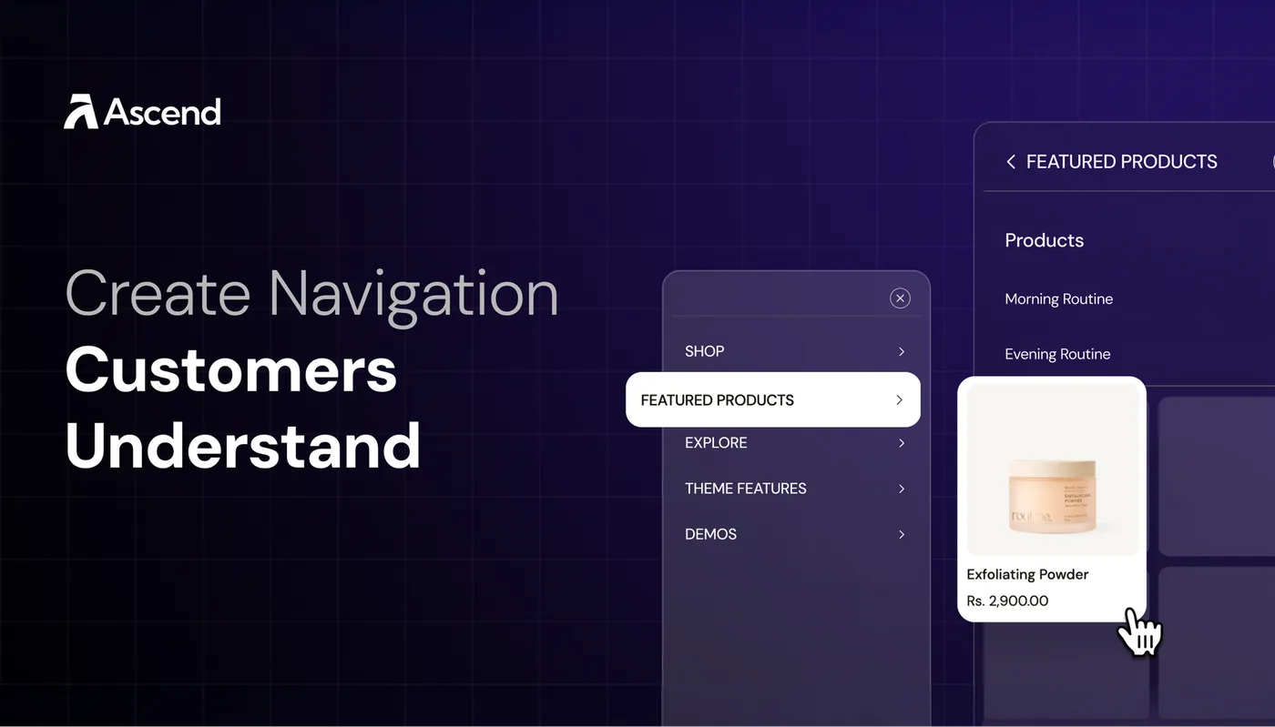
The Header helps shoppers understand your store before they open a product. In Flawless, you can use a traditional menu or drawer, regular dropdowns, and three different mega menu styles. The right setup depends on the size of your catalogue and how customers naturally browse it.
Your starting point
Start with a clear Shopify menu, then use Flawless features where they make that structure easier to explore.
🧭 1. Build the menu and Header
Flawless displays and enhances the menu you create in Shopify admin → Content → Menus. Before adjusting the Header, decide which product categories deserve a place in the main navigation.
Use familiar labels that describe the destination. “Shop,” “New Arrivals,” “Best Sellers,” and “About” are easy to understand. A creative collection name can still appear inside the menu, where the surrounding category gives it context.
Add child links beneath a parent when products need to be grouped. Shopify supports a parent plus two nested levels, but you only need the depth that makes browsing easier. If a parent exists only to open a submenu, use # as its link and include a “Shop all” destination inside the dropdown.
Example: A fashion store could use Shop as the parent, Women and Men as the second level, then Shirts, Trousers, and Accessories as the third level.
🏠 Set up the Flawless Header around navigation
Open the Header section in the theme editor and select the Shopify menu you created. Then choose the layout and behaviour that suit the catalogue.
Header settings:
| Option | Use and details |
|---|---|
| Desktop Header Layout | arrange the logo and menu or use a drawer-style layout. |
| Main Menu | select the menu shown across the store. |
| Dropdown behaviour | choose whether desktop dropdowns open on hover or click. |
| Sticky Header | keep navigation visible while shoppers move down longer pages. |
| Search icon | give shoppers a direct way to look for a known product or category. |
| Highlight button | link one important destination, such as New Arrivals or Shop All. |
| Header and menu color schemes | keep the navigation readable while giving the menu panel its own appearance. |
Flawless also supports a transparent Header with an alternate logo and content colour. Use it only when the logo, links, and icons remain readable over the image behind them. Check every homepage slide if the hero changes automatically.

🗂️ 2. Choose a dropdown or mega menu
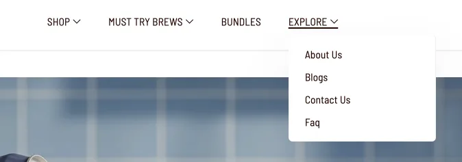
A regular dropdown is often the clearest choice for a smaller catalogue. It opens from a parent menu item and shows the child links beneath it without adding product cards or promotional imagery.
Use a regular dropdown when:
- the parent has only a few child categories
- text labels explain the destinations clearly
- shoppers do not need images to distinguish the choices
- the menu should stay compact
Build and test the regular dropdown before adding a mega menu. This confirms that the Shopify links are nested correctly and that the Header is using the right menu.
🖼️ Use a Collections Mega Menu for category browsing
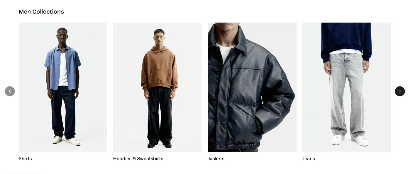
The Collections Mega Menu turns collection links into a more visual category browser. It works well when shoppers recognise categories from an image, such as dresses, skincare routines, coffee types, or jewellery collections.
Its second and third menu levels must link to Shopify collections. Other destination types do not appear in this mega menu. Collection cards use each collection’s featured image by default.
Collections Mega Menu controls:
- the number of collections shown
- collection image ratio
- link alignment
- a submenu style that turns second-level links into tabs
- custom images for individual collection links
When the tab-style submenu is enabled, a second-level tab needs qualifying third-level collection links. A tab without those links is not displayed.
If a collection’s featured image does not crop well inside the menu, create a collection metafield using flawless_theme.megamenu_image. This lets you upload an image prepared specifically for navigation while keeping the original collection image unchanged.
🛍️ Use a Product Mega Menu to bring products forward
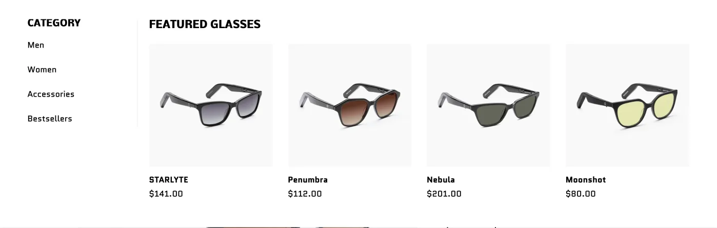
The Product Mega Menu combines a side menu with highlighted products. Use it when showing a small product selection helps shoppers understand what is available before they visit a collection page.
You can populate the featured area with a collection or a manually selected list of products. The side-menu heading can be shown, hidden, or replaced with custom text. You can also add a separate link at the beginning or end of the menu and show it as text or with an arrow.
This menu works well for best sellers, new arrivals, a small signature range, products related to a specific menu category, or seasonal products that still belong inside the main catalogue.
Keep the selection focused. The menu should help shoppers choose a route, not recreate the entire collection page inside the Header.
📣 Use a Promotional Mega Menu for campaigns
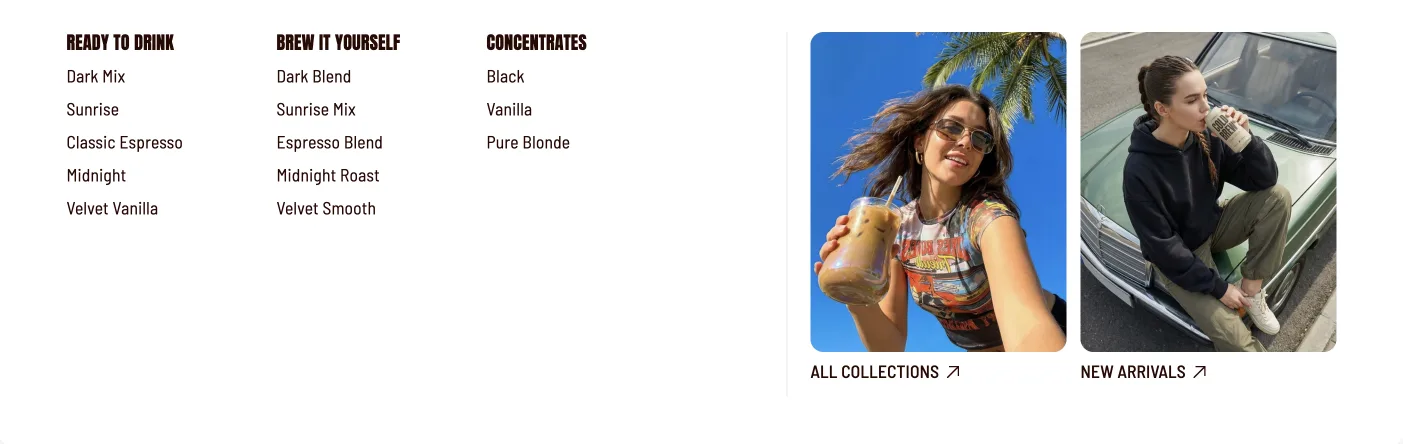
The Promotional Mega Menu combines navigation with promotional images and links. Use it for a current campaign, limited collection, gift guide, launch, or seasonal edit.
Flawless lets you arrange promotions horizontally or vertically. You can choose image ratios such as Adapt to Image, square, landscape, or portrait, then control where the heading and link sit in relation to the image.
Choose one clear theme for the menu. A “Gifts” menu could show Gifts Under ₹2,000, Gifts for Her, and Gifts for Him. A beauty store could use it for a Summer Skin edit.
Remove or replace promotional content when the campaign ends so the Header stays current.
🔗 3. Connect and test the mobile menu
All three Flawless mega menus use the same connection method:
- Create the parent item and child links in Content → Menus.
- Confirm that the parent opens as a regular dropdown on the storefront.
- Add the required Mega Menu block inside the Header section.
- Enter the parent menu name exactly, including capital letters.
- Add the collections, products, images, or links required by that block.
The menu item name is the connection between the Shopify menu and the Flawless block. If the name does not match, the Header falls back to the regular dropdown.
Example: If the parent is named “Shop,” entering “shop” in the Mega Menu block will not connect it. Match the label exactly before troubleshooting the design settings.
📱 Check how mega menus behave on mobile
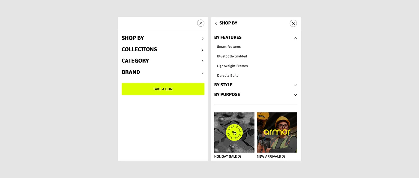
Flawless automatically uses a hamburger drawer on mobile. If you leave the mobile menu setting empty, the drawer uses the main Header menu and can carry over mega menu content, including promotional banners.
From Flawless 11.1, you can assign a separate mobile-only menu. Use this when a large desktop structure becomes difficult to scan inside a narrow drawer. Keep the most important categories near the top and reduce promotional content that pushes product links too far down.
Test each parent item on a real phone. Make sure it expands predictably, the back action is clear, every child link is easy to tap, and the drawer can be closed without losing the page position.
🧩 4. Match the menu to your catalogue
Adjust these starting points to match how your customers shop:
| Option | Use and details |
|---|---|
| wellness products | a Collections Mega Menu can organise products by goal, routine, or format. A Product Mega Menu can introduce starter products or best sellers. |
| beauty products | collections can be grouped by product type, skin concern, or routine. A Promotional Mega Menu can support a new launch or seasonal edit. |
| fashion | use a Collections Mega Menu for departments and product categories. Product and Promotional mega menus can bring new arrivals or seasonal collections forward. |
| food or drinks | organise collections by product type, flavour, format, or dietary preference. A Product Mega Menu can highlight best sellers or a tasting selection. |
| accessories or jewellery | group collections by product type, material, style, or occasion. Promotional content can help shoppers enter a gift guide or limited collection. |
These are suggestions rather than fixed structures. Choose a regular dropdown, Collections Mega Menu, Product Mega Menu, or Promotional Mega Menu according to the number of choices and the information shoppers need before clicking.
✅ Check before you finish
Preview the Header on desktop and mobile, then check:
- the logo and menu remain readable on every page background
- top-level labels describe their destinations clearly
- regular dropdowns open and close as expected
- every mega menu is connected to the correct parent name
- collection images use consistent crops
- featured products and promotional links lead to the right pages
- expired campaigns have been removed
- mobile navigation is short enough to scan and easy to tap
- keyboard users can reach each menu item with a visible focus indicator
Open the homepage, a collection, and a product page. A Header that works over one background or page layout may need adjustment on another.
✨ Wrapping it up: use the simplest menu that helps
Start with clear Shopify menu labels and a working regular dropdown. Add a Collections Mega Menu when images make categories easier to browse, a Product Mega Menu when a focused range deserves attention, or a Promotional Mega Menu when a current campaign needs a visual entry point. Once the desktop structure works, simplify it for the mobile drawer and test every route.
A clear Header makes the catalogue easier to explore.
Get the next teardown in your inbox.
One email a month: new writing, release notes and the occasional look inside how Flawless is built.